
Design Choices: Visualizing Biking in Chicago
March 27, 2014
Last month Divvy Bikes released a bunch of data and held a contest for interesting, novel, cool, and/or useful visualizations. The rules were open-ended and -- like a lot of starting points that I encounter with clients -- amounted to "here's a bunch of data -- what would be interesting/valuable/cool to know?"
Before I analyzed any data from the Divvy Data Challenge, I began with reflecting on my experience with Divvy bikes. I thought about how I used Divvy and why I liked it. This is important because I don’t think that the central use-case of Divvy is obvious, especially to people who haven't used it. Objectors point to limitations of the system: for example, they'd either want to bike more than half an hour or they don't understand why anyone would pay for a subscription service when they already have a bike. I do own a bike and I go on longer bike rides, too, and I once felt this way.
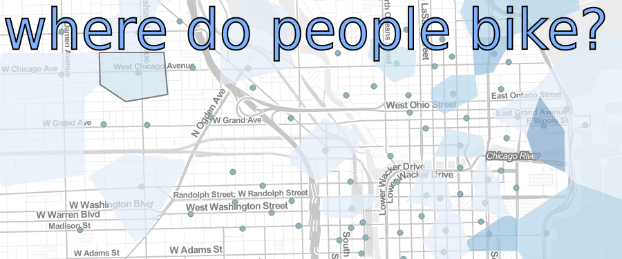
The main reason I like Divvy, though, is that Divvy is like having a bike in my pocket everywhere I go. I don't have to take it with me when I don't want it (like when I'm riding the train, or meeting friends without bikes) and it gives me the freedom to take unplanned one-way trips without committing to biking for the whole time I'm out. Most importantly for Chicago, a city with a hub-spoke transit system (haha), public transit bikes allow you to cross between two main thoroughfares (Milwaukee Avenue and Clark Street) much easier than taking two buses or going in and out of the loop. In visualizing Divvy data, this was the main perspective I wanted to capture. I also wanted to make a tool where people could interactively see how Chicago gets around.
This post is mainly about why I made the visualization I did -- which I'll discuss with reference to the design choices that went into making it. The actual information visualized is pretty similar to a bunch of other visualizations. There were a lot of other beautiful visualizations which I liked, essentially showing similar information. The design choices I made amount to what makes my visualization different: emphasizing the geographic impact and the fact that Divvy bikes change how people get around Chicago.
For those of you unacquainted, Chicago is very much a city of neighborhoods. I’ve lived in Chicago for most of my 28 years in 3 different neighborhoods. The experience of living in each one was very much impacted by the kinds of public transportation available, since I’ve never owned a car. For example, even though Logan Square and Rogers Park are much closer to each other than, say, Hyde Park, in terms of public transportation, they were all equally far away on the CTA. Each of these were cross-town trips that take 2 hours and required travelling through the Loop.
This leaves us with a few questions: How does Divvy change living in these neighborhoods? Does cross-town transportation become easier? To firmly answer these questions would require data we don’t have, but we can get at these questions another way.
Where to start?
Divvy released a data set of 750k one-way trips consisting of an origin station, a destination station, and a bunch of other meta data about the trip (timestamp, gender, bike identifier, etc). One way to interpret this data is as a network that connects each origin station to each destination station, but a 300 station network could have as many as 90k edges associated with it -- far too many to make it easy to interpret. Also, the actual problem that I want to address is not just how bikes flow through the network, but how they flow in geographic space. I’m not interested in which edges in the network are ‘fatter’; rather I’m interested in how the geographic dispersion changes from station to station.
This means that the data needed to be displayed geographically on a map. A map puts the data in the context I want, rather than leaving thegraph free-floating. A map draws the intuitive bridge and makes people realize that they’re seeing something about the city, where distances mean something.
What are those funny shapes around each station?
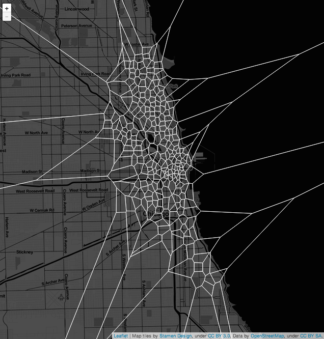
There are a lot of ways to overlay information on a map. Anchoring the network on the map and drawing edges between the stations was certainly an option. So was resizing dots depending on how many trips went through a station. I decided against both of these approaches because I wanted the region around each station to say something about how stations are used by the city.
In thinking about transit-times, I realized that one thing I to emphasize was which parts of the city each station serviced. One way to accomplish this is with a Voronoi diagram, which partitions space into the set of points closest to each divvy station. So each Voronoi cell corresponds to the area in which you would walk to get to that station, because it’s roughly the closest one.
I say “roughly” here because the tiles are made using distance as the crow flies instead of actual street-walking distance. A different approach would have accounted for the fact that you can’t walk through buildings but that you have to walk on the streets. I elected for a more intuitive approach. I felt that the resulting shapes would have been less elegant, would have been more haphazard and thus more difficult to read. Using Voronoi cells with Euclidean distance allows for an interface which is more transparent for the user. Distance on the map already means something to people, and grouping points on a map conveys the idea to people intuitively. Even if people don’t know the word ‘Voronoi’, the concept is clear from seeing it -- whereas using street distances (though it would make a different diagram) might not be.
Voronoi diagrams are also used in user-interfaces to best approximate the “closest point” that a user intended to click. Together, the choice to use a Voronoi diagram was a happy meeting of form and function, displaying which areas a station effects and also allowing for the user to take a seamless “walk through Chicago’s neighborhoods” with their mouse.
Why clipped Voronoi?
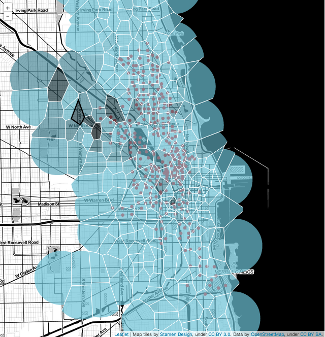
Looking at one of the initial versions of the Voronoi tiling (shown above) I had two thoughts. One was that the Voronoi cells on the west side were huge and visually distracting. People in the distant suburbs --- or California, for that matter --- are probably not going to walk to any of these Divvy stations, even if one is closer to the other. Because I want the Voronoi cells to reflect stations that a person might actually walk to, I really want a clipped Voronoi tiling, where no region has a radius of larger than half a mile or so.
Here there was another design choice. I could have clipped the Voronoi cells with taxi-cab geometric circles that would more directly correspond to the geometry of the city: how people actually walk. People don’t walk as the crow flies, but, you know, they walk on streets. I didn’t do this because I liked how Euclidean disks looked. Disks felt more intuitive and I liked the bubble-appearance.
Why colors and why those colors?
Now that we have regions around each station, we want to know where people go. So when we mouse over each region we want to see that somehow. We could show where people go with lines, but there could be as many as 300 lines leaving any particular Divvy station. That’s a lot. I chose to use color to let users sit back and squint at the big picture as they move their mouse around.
I knew I wanted to use blue as a color to correspond with Divvy’s color scheme. Rather than bucket counts into discrete colors, I initially wanted to represent the actual counts as a linear gradient between two different shades of blue (see previous Voronoi coloring). When I actually made this and looked at it, though, it felt overly complicated and the differences that I intended to emphasize were quite subtle. As a result, I opted to bin the counts into discrete colors. This accentuated the differences more, but interpolating between 5 discrete colors was, according to friends, still too subtle. Half of the pairs of stations never had a trip and yet the color for this was getting in the way of appreciating which pairs actually did have trips.
That’s when I realized I could make the bottom bracket, which indicates few or no trips, less obtrusive if I made it transparent. Colorless is an important color; with this, the color scheme draws attention to the important part where the bulk of the trips ended after starting from any given station. It deemphasizes infrequent trips --- they literally become invisible.
Another major design question with the colors is whether the color scale should dynamically update with each station to emphasize percentages or remain static to make it easy to directly compare trips between stations. I opted to dynamically update the color scale for two reasons. The first is that the Divvy stations were progressively rolled out throughout the year so many stations have fewer trips because they haven’t been around as long --- without displaying this fact some other way, it could lead to wrong conclusions. The second is that the main idea I was trying to convey is not which station is most important but where do people go from here. With raw trip counts, many stations would have had no colors coming from them at all -- which is exactly what you’d want if you were trying to display importance. It would give little or no information about flow, however.
What are some drawbacks with this approach?
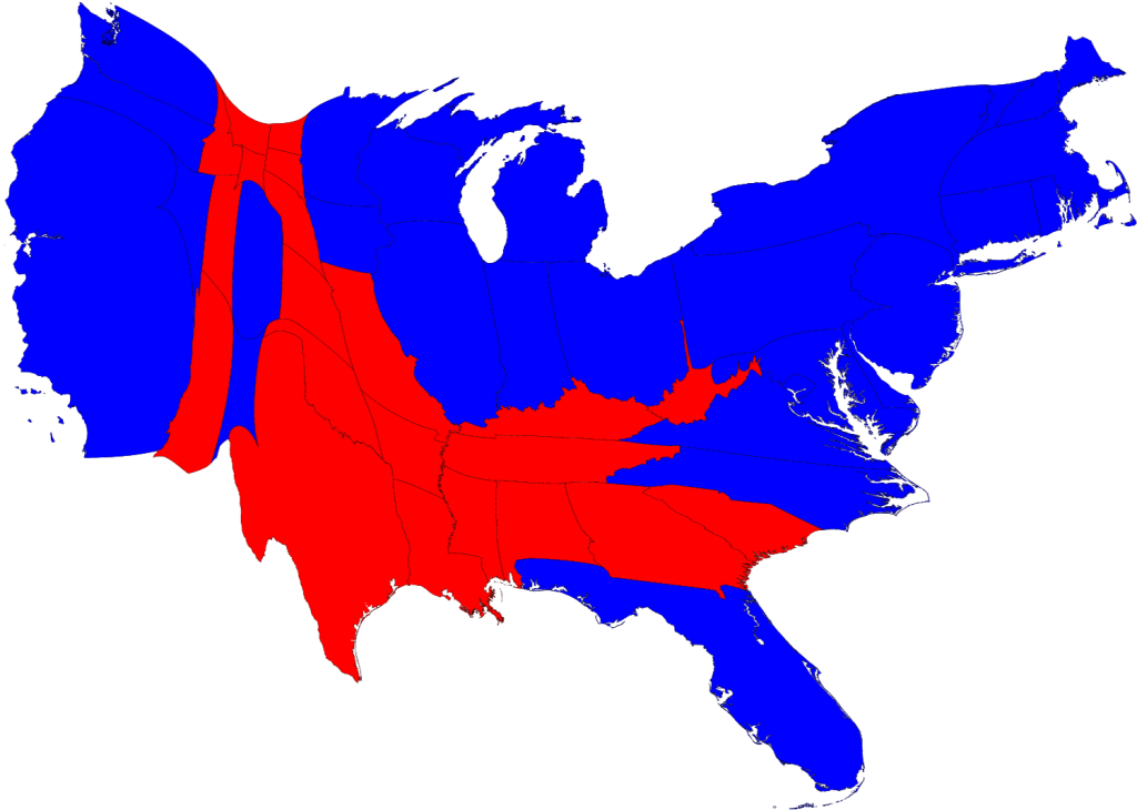
The main visual tradeoff of a heatmap Voronoi diagram is that the colors of larger cells are more prominent, overemphasizing trips to the Divvy stations on the periphery where there are larger Voronoi cells. This is a problem with displaying information on a map -- and presidential election maps have the same challenges. Other election maps address this by distorting geography to account for electoral weight, but distorting the map makes the geography more difficult to recognize.
The Voronoi diagram requires some interpretation by the user, this drawback is also a feature. Bigger Voronoi regions don’t mean “better stations”, but rather mean that a single station is serving a larger area. In fact, area of Voronoi cells might negatively correlate with usage.
Future work
The current work prioritizes space over everything else. The main aspect that I neglected in the work to date is to incorporate the element of time, which is also highly correlated with bike flows. I could imagine approaching this by either incorporating a line graph showing trips over a 24 hour period from a given a station or imposing a filter on the choropleth. Currently, I favor the former, because it leaves the current map intact and adds an extra dimension for comparison. Also, some stations have much lower counts and filtering these would probably just introduce noise.
I wanted to create something for people to explore for themselves, but I think the visualization in its current stage is difficult to approach for the first time. While most people with whom I’ve demoed this have eventually been able to see something in the visualization and do understand what they’re looking at without me explaining it to them (win), many still feel like there is “something left for them to get”. I think this has to do with how the app “introduces itself to people.” I’d like to work on easing people into the interactivity as I think that’d help.
In conclusion...
One challenge of interactivity is that it can be mentally taxing. It involves making hypotheses and drawing conclusions. It requires mental work. The task of the visualization, though, is to make this easy. If you have any other ideas for things that could be useful or things that would make the user experience more engaging, please drop some suggestions in the comments. I plan on improving this for the Bay Area Bike Share data challenge soon…


